Two new Windows 11 features are frustrating users
Windows 11 continues to get new capabilities, and in many ways, that’s a good sign. The operating system is changing, modernizing, and expanding its reach. However, not all add-ons improve the experience. Some features feel redundant, awkward, or just plain unnecessary in day-to-day practice.
To be clear, this is not about AI integration or privacy controls. I have made my position clear on those topics. AI should always be optional, and no silent component should exist in the System without the express consent of the user. Privacy must include a clear, centralized control mechanism. That conversation is different.
Snap Assist and drag the Tray
Snap Assist itself is not a problem. The layout menu that appears when you hover over the zoom button is useful. It was done on purpose. You hover over the target, review the layout options, and select one. Keyboard shortcuts like “Windows key + Z” they are also practical and accurate. These methods feel controlled and predictable.
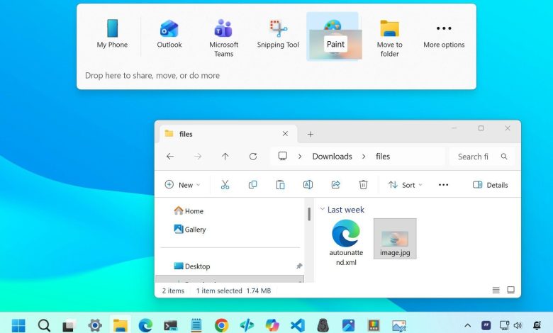
The Snap Assist tray at the top of the screen is different. When you drag a window to the top edge, Windows 11 displays a flyout overlay with multiple capture points. While it may be useful for new users, it presents a conflict for experienced users who want to quickly maximize or resize a window. Instead of fluid movement, you encounter a visual element that demands attention.
Actually, I’m not the only one. For example, The Zermist on Reddit he said: “I wonder if there is a way to get rid of this gray window that appears every time I drag a window near the top of the screen. this feature has been annoying me for months and I finally want to get rid of it permanently.”
The drag tray makes it worse. As you drag files around, Windows 11 tries to anticipate your intent and layout suggestions. Instead of improving productivity, it can feel like the App is second-guessing itself. The experience of working with files should be fast and seamless. If visual overlap occurs repeatedly during simple drag actions, the experience becomes more than it needs to be.

On Reddit, regarding Drag Tray, industries10 notes: “Is there a way to get rid of this annoying pop-up bar in File Explorer? I used to be able to easily drag and drop files between tabs in File Explorer, but now every time I drag files up the screen to insert another tab, this pop-up bar seems to block access to the tab.”
The app has historically been good at giving users control without unnecessary visual distractions. The expand button menu and keyboard shortcuts honor that philosophy. The Snap flyout at the top of the screen, in contrast, introduces helpful features that most power users don’t need or want.
Disable the Snap fly and drag the tray
If you agree and prefer a cleaner experience, you can disable this behavior using Settings. To disable Snap Assist flight, use these steps:
- Open it Settings.
- Click on The program.
- Click on To do many things page on the right.
- Click on Click the windows preparation.
- clear the “Show snap properties when I drag a window to the top of my screen” option.

Once you’ve completed the steps, the top Snap tray will no longer appear, while normal snapping with keyboard shortcuts and the zoom button will continue to work.
You can also turn off the suggestions that appear when you drag a file to the top of the screen.
- Open it Settings.
- Click on The program.
- Click on Close sharing page on the right.
- close the “Dry Tray” change change.

After completing these steps, the file sharing flyout will remain disabled unless you manually re-enable it.
Windows Central takes over
Windows 11 is currently in an unknown location. On the other hand, Microsoft keeps making really useful improvements – better accessibility tools, smarter window management, cleaner settings pages, and a steady march towards a more modern OS. On the other hand, the company doesn’t seem to resist adding features that feel like they belong to a completely different product.
The two additions highlighted here aren’t “bad” in the catastrophic sense — they’re bad in a way The classic Microsoft way: well-intentioned ideas that end up consolidating practice instead of improving it. Windows 11 doesn’t need additional layers of AI-powered suggestions, recommendations, and tweaks. It needs clarity, consistency, and a start menu that doesn’t sound like a billboard for whatever Windows thinks you should click next.
These features aren’t criminals, but they are signs of a larger trend: Windows 11 is pulling a bit more “busy” instead of “better.” And if Microsoft wants users to embrace the OS long-term, it needs to focus less on innovation and more on making the core experience feel polished, predictable, and actually useful.
We want to hear from you!
👉Are these new Windows 11 features really useful, or just getting in the way? Drop your thoughts below — especially if you’ve already come across them in Insider’s latest build.
Additional services
For more helpful articles, features, and answers to common questions about Windows 10 and Windows 11, visit the following resources:

Join us Reddit at r/WindowsCentral to share your information and discuss our latest news, reviews, and more.