
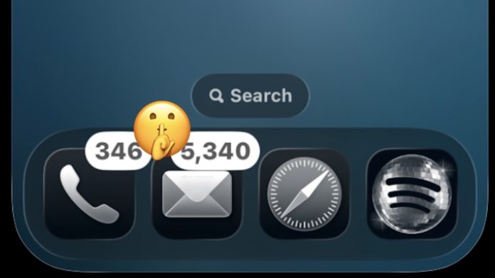


Ever since Liquid Glass first appeared, there has been a debate about using Clear Icons on the iPhone and iPad Home Screen, with some users really liking the feature and look, and many other users questioning its utility and usefulness.
Some seem to dislike the look of clear icons due to Liquid Glass in general, but I actually find it to be one of my favorite features of Liquid Glass in the new OS 26/27 interface style. I can even say that I am a big fan of Erase Icons on iPhone and iPad. I think they look really cool and give a subtle look to the iPhone and iPad Home Screen. But looks alone aren’t the reason I love Clear Icons on iOS/iPadOS, and there’s a specific reason Clear Icons is my favorite look for my iPhone and iPad.
So, which is the best part of using Clear Icons? In my opinion, it is The Clear look removes all the obnoxious bright neon colors that are deliberately designed to grab our attentionover and over again, until we click and engage with apps. Enable clear icons, and each bright Home screen color that distracts and hungers for attention, is now muted. Ahhh, relief!
Clear Icons = Less Disruptive Home Screen & No More Obnoxious Red Warning Badges
Using Clear Icons not only removes the bright neon color from app icons, but perhaps best of all, the Clear look also removes the attention-grabbing bright red badge icons that sit on top of most icons when there is a notification or warning associated with that app.
The red notification badges drive me up the wall, and there is no way to disable them globally across the entire app, without removing whatever is causing the warning/notifications to trigger. But the reds are very bright and hungry, and they force your eyes to notice whether you are worried about whatever they are warning you about or not.
Yes, the flashing red badge on the Phone app, I know I have 240+ voicemails and 117 missed calls, no I don’t intend to listen to them all again, and most of the missed calls are spam.
Yes, the flashing red badge in the Mail app, I know I have 5,000 Mail app emails and no I don’t intend to read or mark them all as read.
Yes, the bright red badge in the Messages app, I realize I have dozens of unread messages.
No, the flashing red notification badge on the Instagram app, I don’t care if Instagram has 200+ unread messages, and more than half of them are spam.
No, it’s a flashing red badge on the Gmail app, I don’t care if Gmail has 17000 unread emails.
No, the bright red number warning badge in the Telegram app, I don’t care if a few Telegram groups have resulted in 800+ unread posts.
Ok App Store red badge, I have 80 apps I rarely use that need updating, I don’t care and none of them require the urgency of a bright red badge.
And so on and so forth.
The urgency presented by these, and others, with their bright red badge and number indicating anything we should be concerned about immediately, but in fact does not really want our attention, annoys me.
Clear icons finish all that. No more neon icons screaming to be looked at, no more bright red notification badges screaming for attention. With a clear icon look, the icons are still obvious, the notification badge is still there, but it’s probably less confusing. And on my iPhone, and iPad, where the notifications of the most used apps and the bright neon colored slop are at an all-time high, I find the Clear view to be a sight for sore eyes.
A clean Home screen with clear icons and widgets, provides a very welcome relief, and makes my iPhone and iPad very pleasant to use.
I’ve also come across using Clear Signs on a Mac, which offers the same benefits of the nice look and neatness of the horrible neon colors and bright red badges, but the way my Mac is set up is such that there’s no need for that. My dock is set to hide by default, and if I don’t open apps that way I start apps with Spotlight, so there’s no visible clutter on my Mac. So on my Mac, I usually use the default dark and light icons and the default dark and light theme mode. But you better believe that when Mac experience slows down to the point where every single app is showing a bright red notification badge, I’m going to start using Sula to silence that visual noise.
Anyway, those are my thoughts on using clear icons, and why I really like them, especially on my iPhone. But this Liquid Glass feature is somewhat controversial, and some people don’t like it or don’t use it at all, and others question the compatibility of this because it can make app icons more difficult to distinguish. I understand that point of view, but I don’t see that as an issue for me. So what do you think?
What are your thoughts on the clear icon look for iPhone, iPad, and Mac? Are you using a Clear look? Have you tried using clear icons and changed your mind? Share with us in the comments!